
Role
UX/UI Designer (Contract)
Timeline
4 Months
Team
3 Designers, 1 PM, Dev Team, Marketing Leads
The Challenge
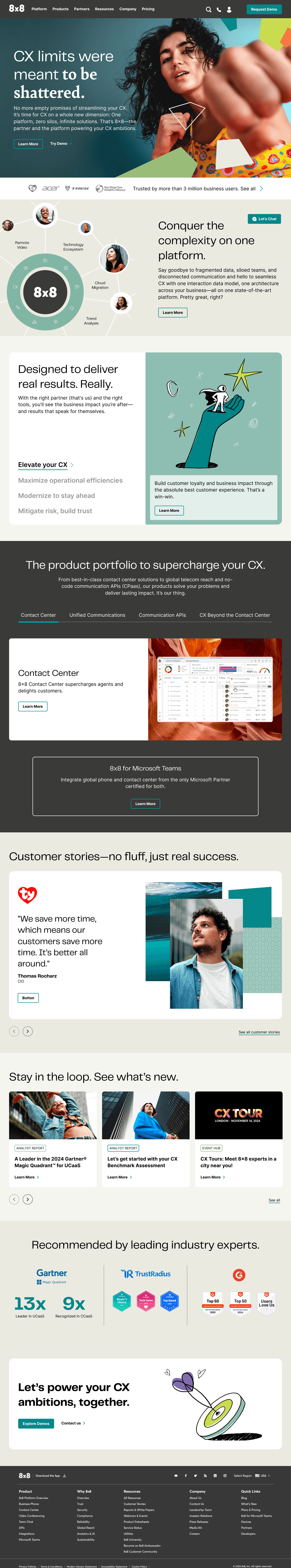
8x8 was undergoing a major rebrand to reposition itself in a competitive cloud communications market. Our challenge? Transform the legacy website into a high-converting, modern platform that reflects the new brand identity all while improving UX consistency and speed of execution.
Why This Redesign Mattered
8x8’s website was struggling to keep up with the brand’s growth. It lacked consistency, had a patchwork of disconnected templates, and slowed down how quickly teams could launch pages. The redesign was more than just a facelift it was a strategic move to align with their rebrand, improve marketing agility, and support business growth at scale.
Key Challenges
Fragmented Structure
Dozens of disconnected templates made maintenance painful and slow.
Inconsistent Visuals
No unified design system, leading to brand inconsistency across pages.
Slowed Launch Cycles
Every new page needed custom tweaks, slowing marketing and product teams.
Limited Flexibility
No scalable component library, making A/B testing and rapid iteration harder.
Process
Even though this was a brand-led revamp, we made UX count where it mattered:
Ran stakeholder interviews to understand real goals
Conducted lightweight UX audits to find friction points
Repeated QA cycles to tighten the design–dev handoff
After the contract the access was taken away so I couldn't collect more data!


After the workshop with Stakeholders We were used to given Information
✨ How We Brought It to Life
Bridging the Old and the New
Before the new visual identity arrived, we were already shipping pages with the existing design. Once the rebrand was finalized, we pivoted auditing the in-progress work and aligning it with the updated brand direction.
This transition phase helped us spot inconsistencies early and paved the way for a more strategic overhaul.
Building the Foundations
Once the refreshed brand guidelines landed—typography, colors, tone we began shaping a scalable system:
Defined layout grids, spacing rules, and core foundations
Created UI components like buttons, navigation, cards
Built a clean, reusable library for fast handoff
Worked closely with devs to ensure seamless implementation
This gave us the stability to move fast without sacrificing consistency.


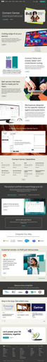


Scaling with Purpose
We tackled high-impact pages first like the homepage and solution pages to set the tone. From there, we expanded the system:
Finalized key layouts with stakeholder input
Ran QA and design polish reviews
Scaled across 40+ paid media pages and landing flows
Each layout followed modular logic, allowing easy updates and cross-team reuse.
Responsive & Accessibe
Responsiveness was a core priority — components weren’t just visually appealing, they were built to adapt. We adjusted layouts and padding for smaller viewports, prioritized thumb-friendly CTAs on mobile, and maintained text readability with proper color contrast.
Accessibility was reinforced through usability testing on components, colors, and typography to ensure an inclusive experience for all users.


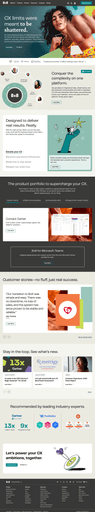
The Solution
We translated the new 8x8 brand into a scalable web experience by building a flexible design system from scratch. I designed key UI components, rebuilt core pages, and created modular templates used across 50+ marketing and product pages. The result: faster launches, brand consistency, and a site structure that could grow with the business.
We restructured the page hierarchy and streamlined navigation to support scalability, especially as 8x8 expanded its marketing and paid media content
Impacts
While I didn’t retain backend access after the contract, the rollout spoke for itself. We shipped over 40 redesigned pages spanning the homepage, solution overviews, and paid landing flows powered by a clean, modular system built from scratch.
Design wasn’t just delivered it was embedded into the organization. From tighter design–dev handoff to faster go-to-market timelines, the project laid down a system 8x8 could truly build on.
📊 According to SimilarWeb, 8x8.com sees around 1.5M monthly visits. Even a modest 1–2% uplift in conversions could translate into significant business impact.
Approach and Results
🔍 Design Audits: Evaluated existing UI for gaps & issues
🎨 UI Component Design: Crafted reusable visual elements
🏗️ System Architecture: Structured the design system for scalability
🔄 Responsive Optimization: Ensured layouts adapt to all devices
🤝 QA & Dev Sync: Maintained alignment across design and development
🧩 Modular Design System: Built for 50+ pages
⚡ Faster Page Creation: Enabled quick updates for marketing teams
📱 Responsive Templates: Designed for homepage, solutions, and paid media pages
Reflections
Design for Function First
Learned to prioritize usability and consistency over aesthetics while aligning with corporate goals and technical feasibility.
Embracing Real Constraints
Worked within shifting requirements, brand rules, & timelines staying flexible while still delivering scalable design solutions.
Justify Every Decision
Asking the right questions and explaining design choices clearly built trust with stakeholders and improved collaboration.
QA as a Design Habit
Regular design audits and QA checks helped catch inconsistencies early, leading to smoother handoffs and stronger final output.

