The Challenge
Audit Ally, an Ai-driven finance platform, needed a polished digital presence to prepare for launch. I was brought in mid-project to complete their SaaS platform and build their website with just a loose theme, no documentation, and limited client contact. The clock was ticking. Despite the lack of guidance, I took ownership of both the website and product, making fast, confident decisions while learning SaaS on the fly.
Turning a fragmented prototype into a cohesive product gave Audit Ally the consistency it needed to be launch-ready and easier to scale.
Approach
Rapid Familiarization
I quickly mapped the existing product, identified gaps, and prioritized improvements without slowing delivery.
A Visual Baseline
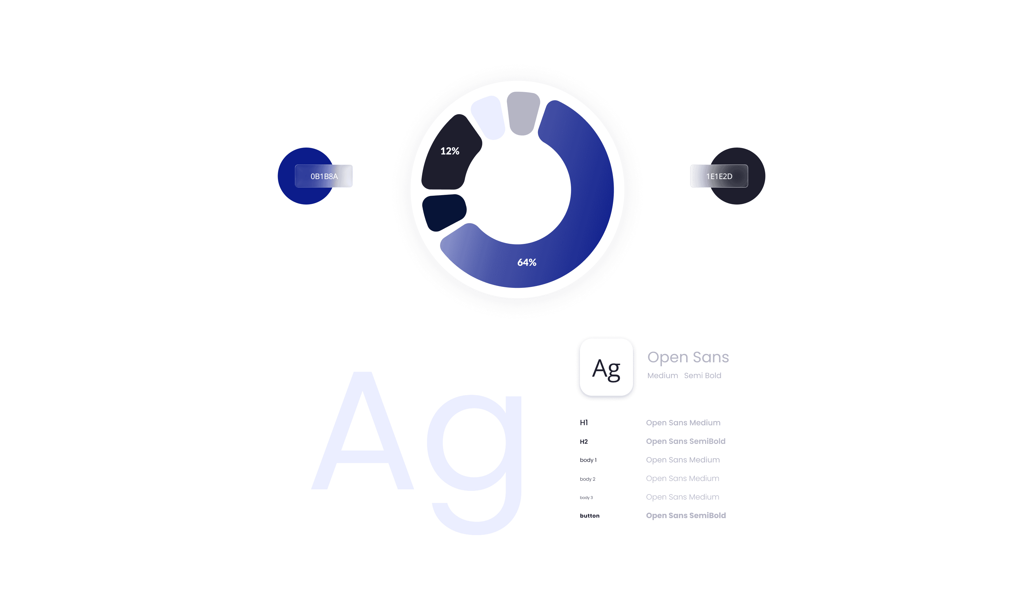
Created a style guide (colors, typography, spacing, core components) to align the product and website.
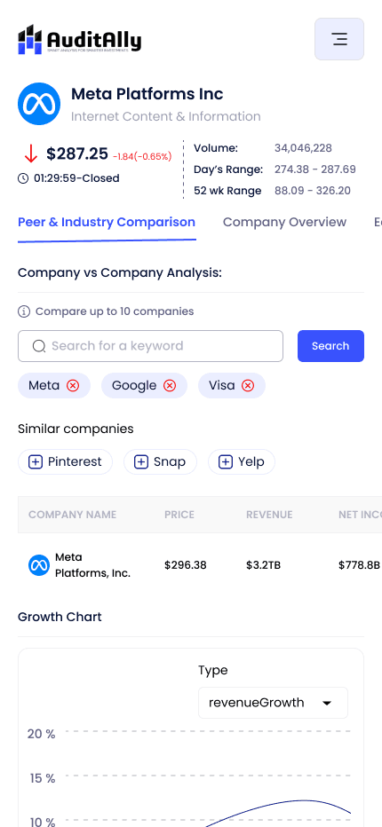
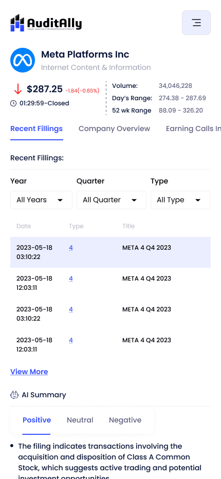
Data-Heavy UX
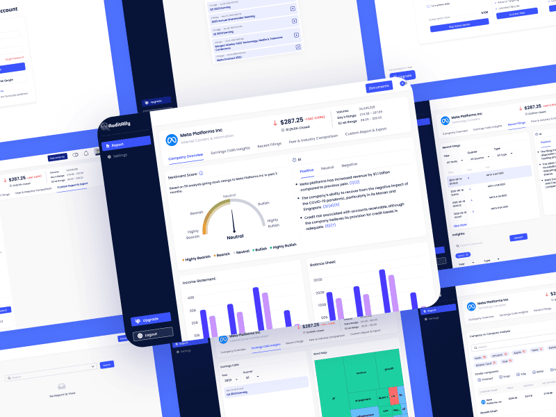
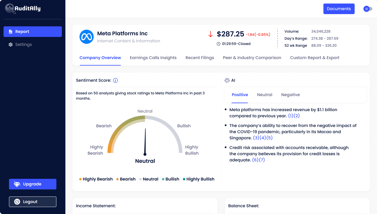
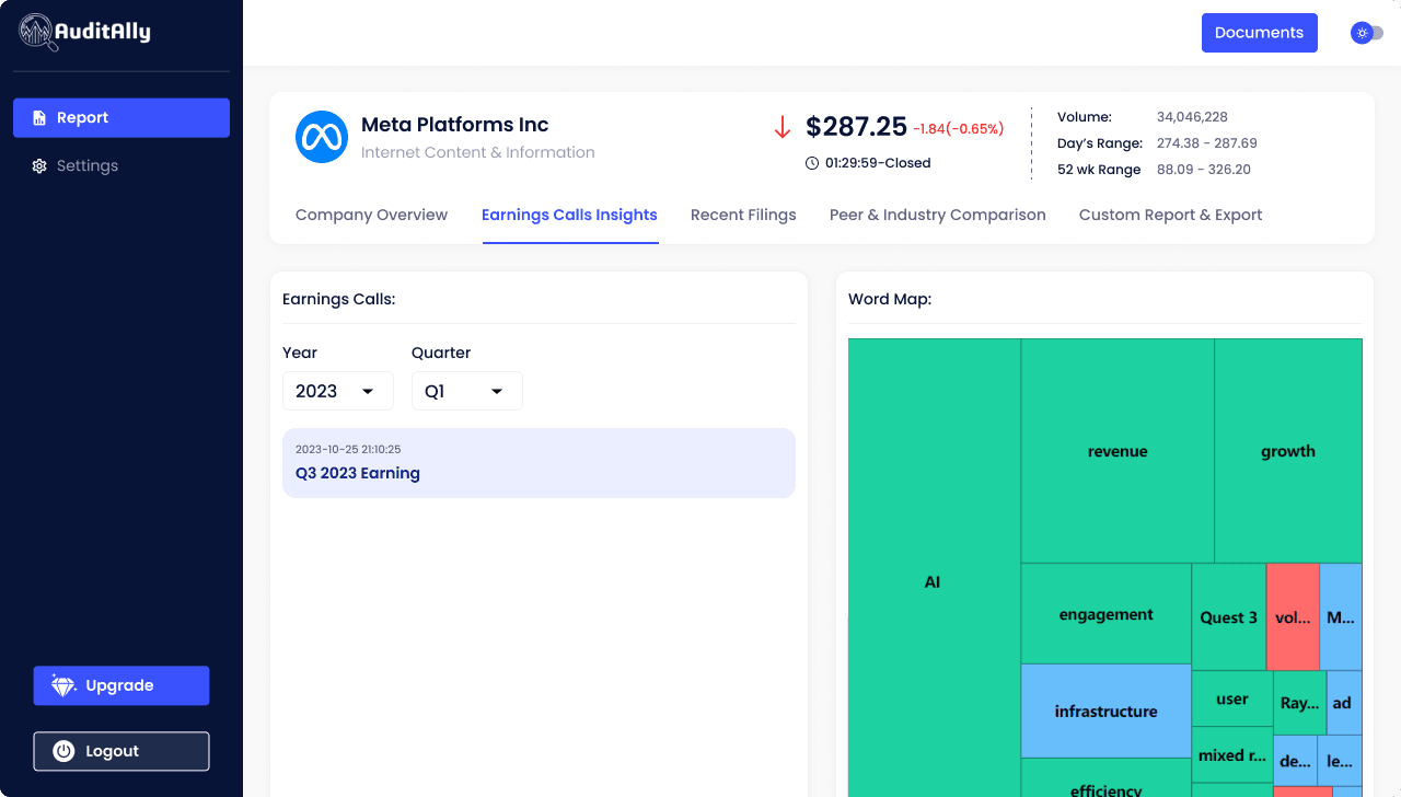
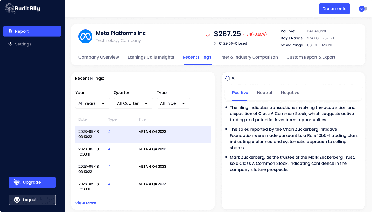
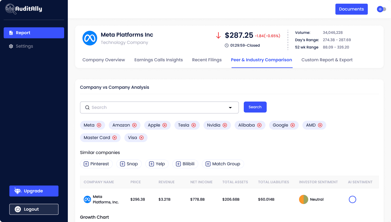
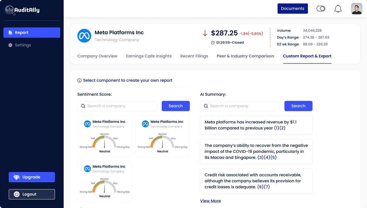
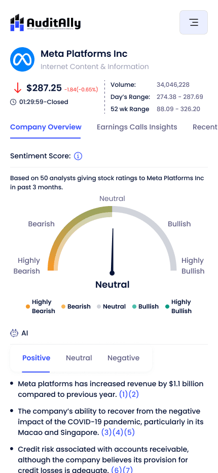
Designed navigation, charts, and dense tables to adapt while maintaining clarity and balance.
Reusable Components
Built a small but scalable component library optimized for heavy content and future updates.
Building a Visual Foundation
Before jumping into high-fidelity screens, I created a lightweight style guide to bring some visual consistency. This included:
Color palette (light/dark themes)
Typography rules
Basic UI components (buttons, tables, inputs)
This helped speed up the design process and made it easier to maintain visual alignment especially with no developer collaboration or design QA buffer.
The Website
I started by designing the website, creating a visual style guide and responsive layout system from the ground up. The goal was to clearly explain Audit Ally’s value in a clean, modern layout in both light and dark mode.

The SaaS Product
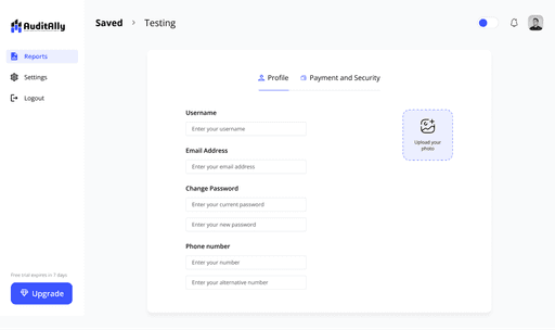
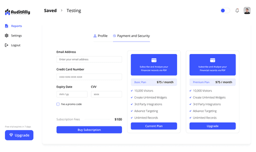
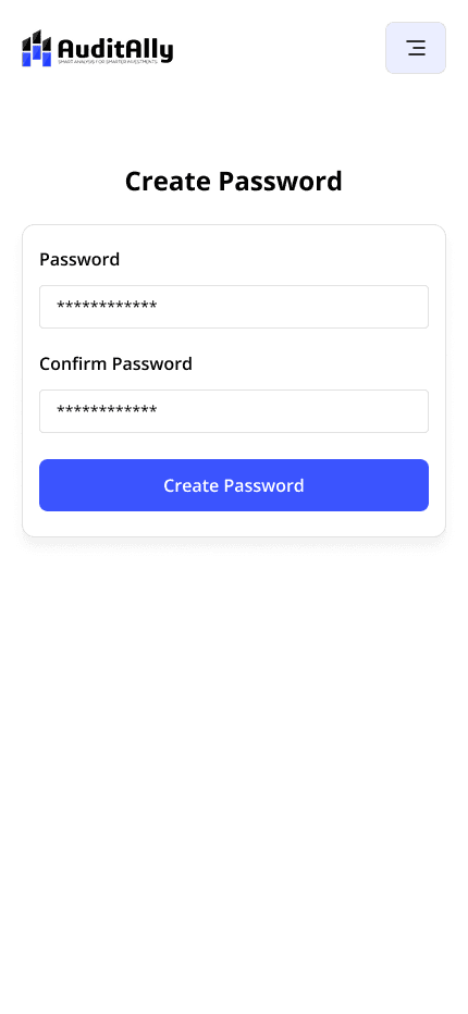
Rebuilt unfinished flows and added missing ones (onboarding, pricing, setup)
Completed half-done core screens with consistent patterns
Designed reusable components (charts, tables, cards)
Supported both light & dark modes with responsive layouts
Focused on clarity, hierarchy, and feedback for data-heavy UI
Responsive Design
I designed adaptive layouts to work seamlessly across desktop, tablet, and mobile. By keeping spacing, layout, and typography modular, we ensured clarity and usability on every screen size.


The Solution
With zero documentation and a tight timeline, I started by creating a Visual Style Guide to bring consistency. Then I tackled the website and finished the SaaS platform working screen-by-screen to unify the experience.
Reflections
This project was my crash course in SaaS design, forcing me to grow my decision-making speed and problem-solving under pressure. It taught me how to design effectively without all the resources in place something that’s shaped how I approach every fast-paced project since.

