Transforming an outdated B2B site into a modern, conversion-driven platform.
Live Site
Role
UX/UI Designer (Contract)
Timeline
Feb 2025 – Present (Ongoing)
Team
3 designers, 6 devs, 4 PMs, 3 QAs
How Do We Started
We were first hired to maintain the old theme and deliver a few pages. Our initial assignment was the Extreme Academy pages it gave us a chance to collaborate with product teams, define two personas (Partner and End User), map their flows, and deliver hi-fi designs.
It led to a Full audit, that revealed issues: high drop-offs, confusing interactions, & clunky mobile layouts. What began as maintenance quickly turned into a full redesign.
The stakes: an enterprise site with hundreds of pages, multiple teams, and a tight deadline. Our small team had to prove we could deliver a modern design that scaled fast.


Problem
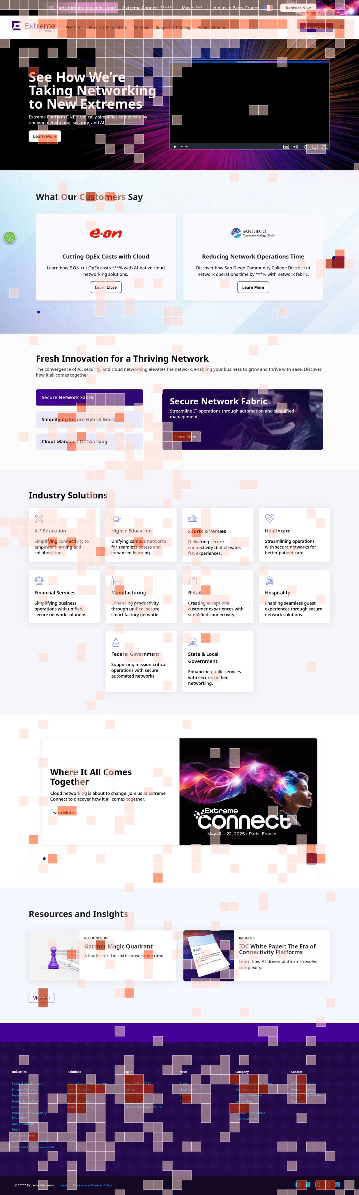
User behavior revealed deeper flaws:
50% of users dropped after the “Customer Stories”.
Users kept clicking on non-interactive elements, expecting interactivity that wasn’t there.
The Industry Solutions section saw very low engagement.
Mobile layouts felt inconsistent and frustrating.
The site felt outdated. Stakeholders needed a design that was cleaner, interactive, and conversion-driven.
Research and Explorations
We studied heatmaps and click data with MS Clarity, then benchmarked against competitors. Our first low-fidelity wireframes fell flat - they looked too similar to the old site.
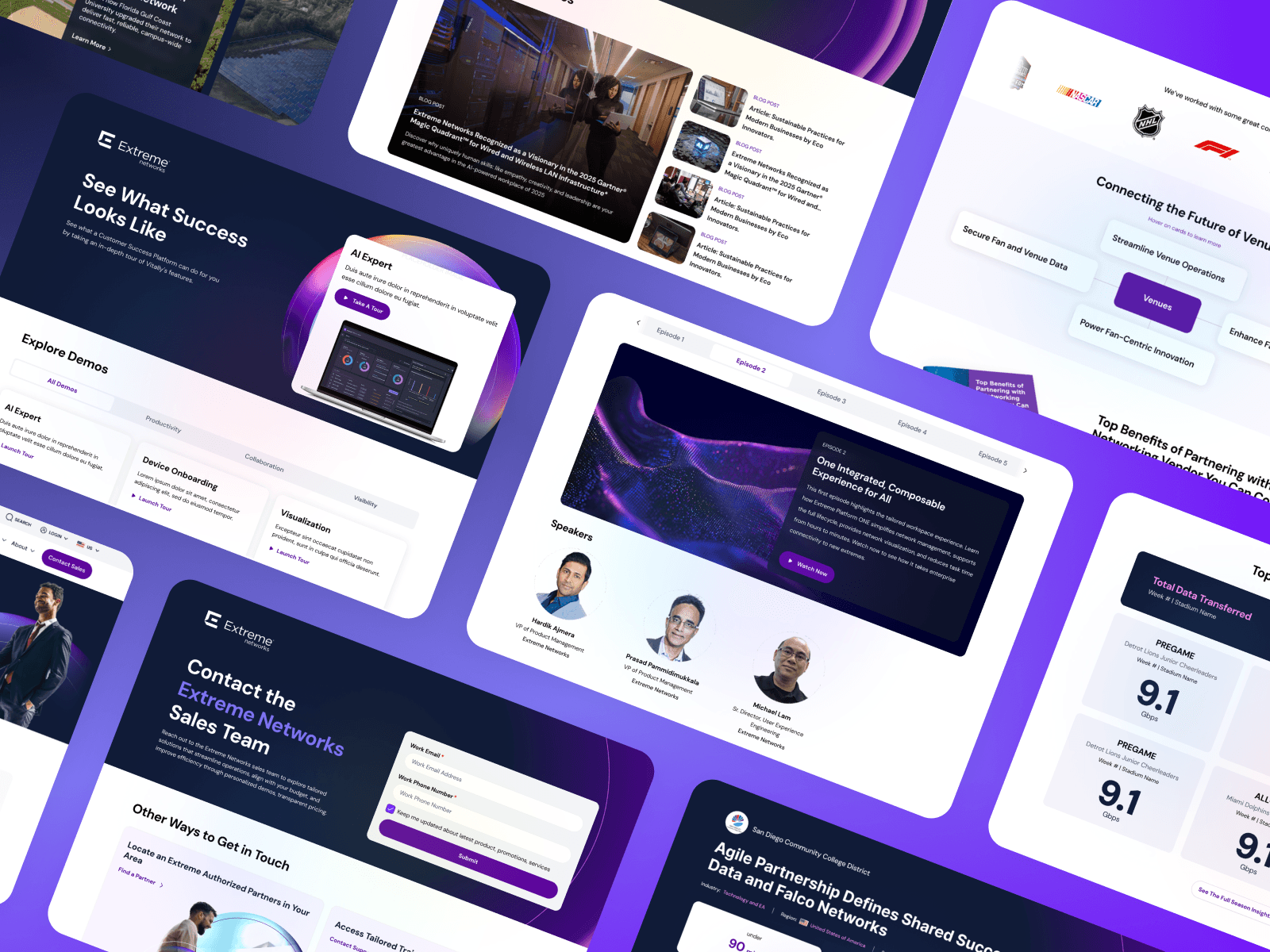
So we shifted: building an extensive moodboard, iterating on layouts, experimenting with hierarchy, and reducing the “wall of cards” problem. After countless variations, we pitched two polished landing page concepts.
One won unanimous approval from stakeholders - becoming the foundation of the redesign.

Building the Foundation
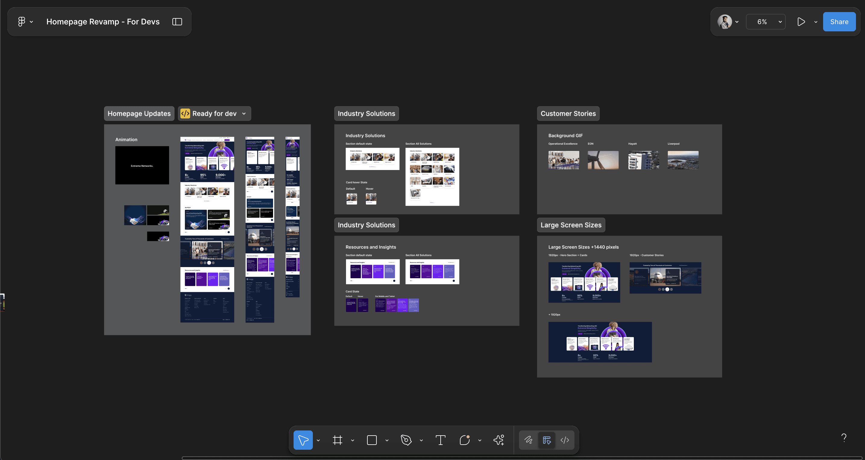
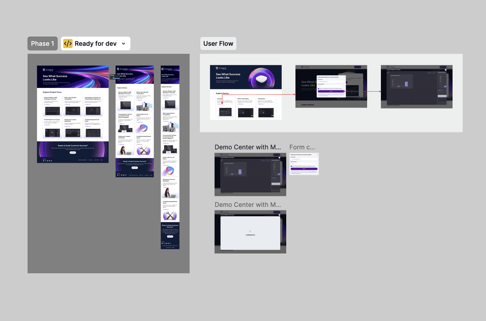
With the approved theme, we had to ship five key pages in Phase 1.
Because of deadlines, we set up only a UI Foundation file (colors, typography, spacing, icons) instead of a full component library. This got the site launched, but also revealed the pain of working without organized components resulted in a slower delivery, scattered elements, and inconsistencies.
Still, hitting that first milestone earned us trust and gave us the runway to improve.
Expansion
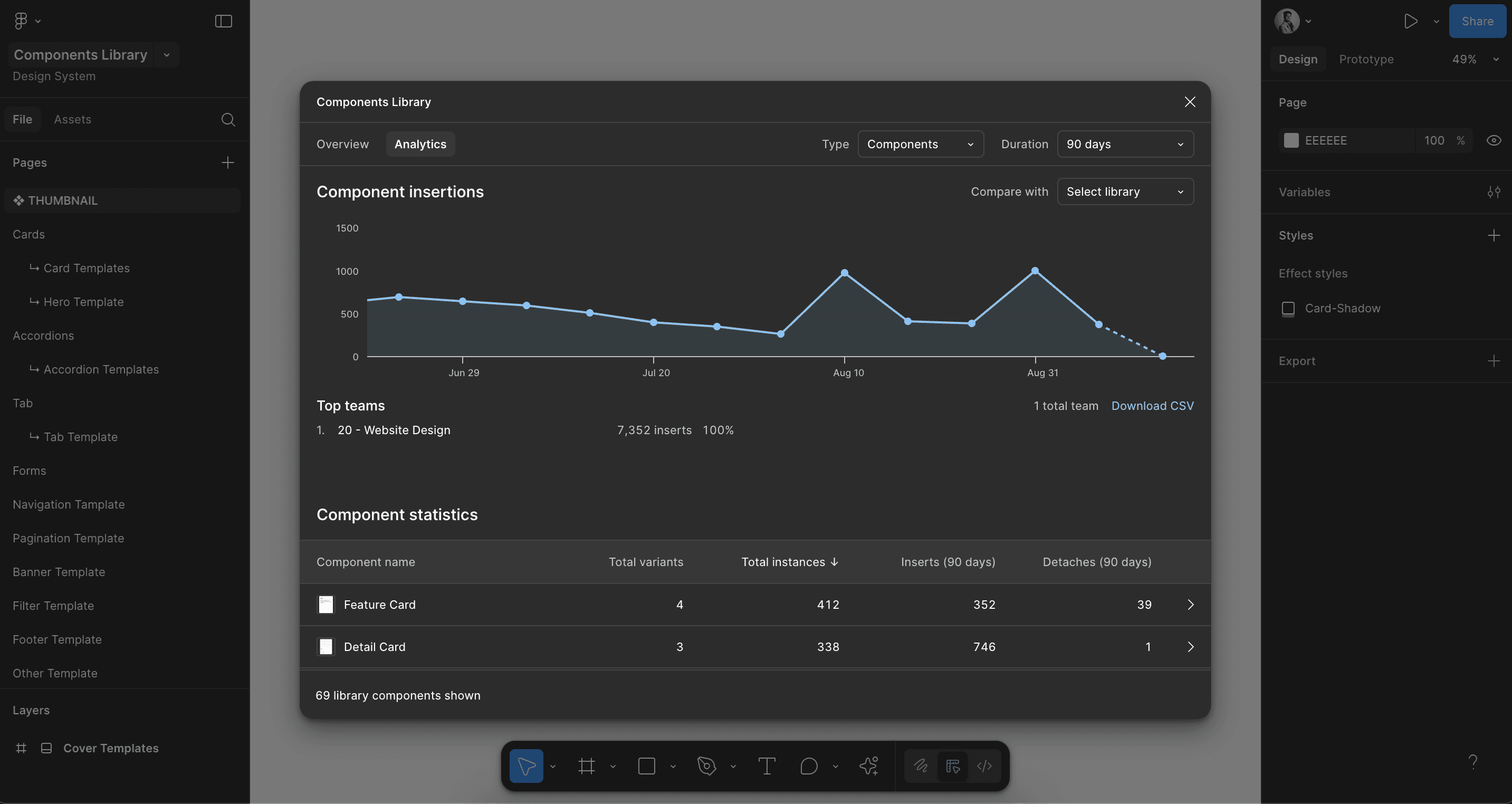
Phase 2 scaled our work with ~20 product and solution pages. By leveraging the new component library and dual-file workflow, we cut delivery time by ~60%.
Phase 3 shifted focus to content and SEO-heavy pages: Partner, Blog, SEM/DEMO, Resource hubs, and product demo experiences. With our solid foundation in place, we became proactive often preparing designs and templates before stakeholders even requested them. This not only sped up approvals but also gave devs more lead time for implementation.
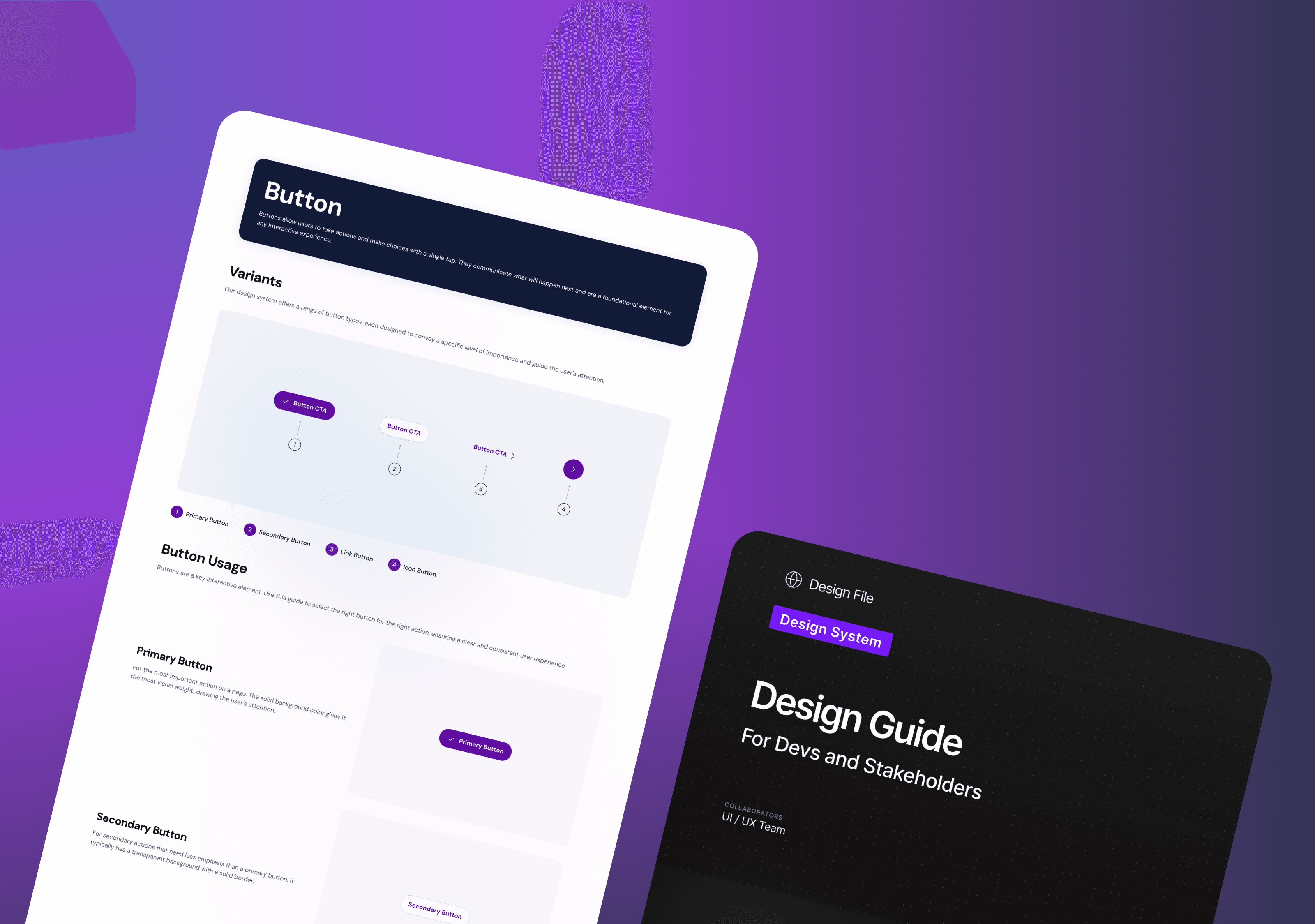
The Design Guide
To align teams beyond design, I led the creation of a component-first Design Guide in Figma. Instead of repeating explanations, we documented how each component works, behaves, and should be implemented.
Covered usage, properties, responsive states, accessibility, and best practices
Used daily by QA, SEO, Legal, Academy, and Devs
Reduced back-and-forth and improved integration speed and consistency
Results & Impact
Our redesign not only sped up delivery but also built lasting trust and consistency across teams.
~60% faster delivery
Phase 2 & 3 vs. Phase 1
Consistent system
Design System + Design Guide
Proactive team
Designs ready ahead of requests
Broader influence
Academy, Plugin Integration, Interactive Demos
and the system keeps scaling…
Learnings & What’s Next
Leading the component library taught me the cost of mistakes at scale and the value of atomic design. I learned to ask sharper questions, take ownership early, and balance speed with usability.
Going forward, we’re expanding into SEM/DMO pages, refining components, and supporting new launches. The redesign has positioned Extreme Networks with a scalable, user-centered platform for the future.

